Case Study: TELUS
SITUATION AND OPPORTUNITY
This was a semester long project in my fourth year of the Graphic Design for Marketing program at the Wilson School of Design. We were tasked to select an existing company/organization that is in need of a rebrand to help them communicate more successfully to their target audience. The rebrand was also be realistic in our approach, acting as if it was a real-life project. For my project, I decided to rebrand TELUS to help them express how they are redefining what it means to be a telecommunications company.
RESEARCH AND STRATEGY
In my research for this project I was fortunate enough to utilize my network of friends to obtain an interview with the brand manager at the TELUS Brand office. Through this person I was able to get information that would contribute to the success of this project.
Key insights that helped drive this project:
The meaning behind their current mark had been lost over the years, and is simply referred to as the “flying T”.
Supporting visual identity was adapted from a cellular phone service provider when it was acquired by TELUS.
TELUS is more than just a telecommunications company, they are shifting their focus from selling technology to customers, to how their technology can improve and enable the lives of their communities.
The strategy for this project was to strengthen their relationship with their target audience by creating a visual identity system that would help communicate their shift in focus more easily and clearly, and keeping what aspects of their current brand that were successful in supporting their new focus.
DESIGN SOLUTION AND OUTCOMES
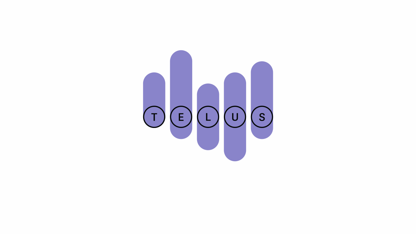
The inspiration of the design solution honours their roots of being first and foremost a telecommunications company, the principle mark is reminiscent of the traditional North American rotary phone dial. It consists of five dials encompassing the individual letters of TELUS. Like the telephone, the principle mark is a vessel that helps TELUS communicate who they are to their customers.
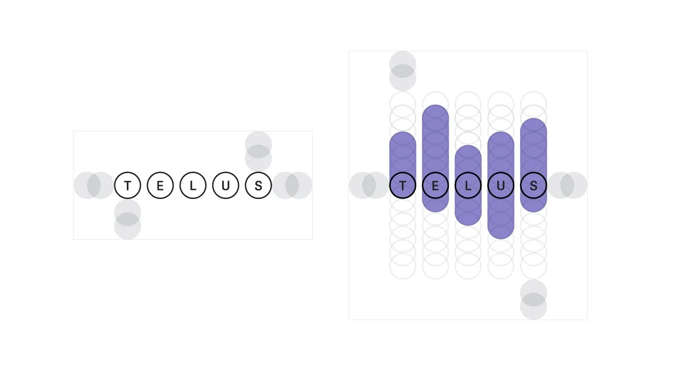
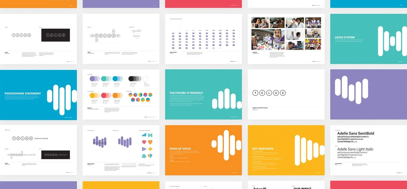
The system of bars that accompany the principle mark to help communicate specific messages, products, and services TELUS offers. Combining these elements with an updated color palette and supporting palette that provide high contrast, I’ve enabled TELUS to have a more fresh, friendlier appearance. Knowing that the telecommunications industry can be seen as contentious to the consumer, enabling this was key.
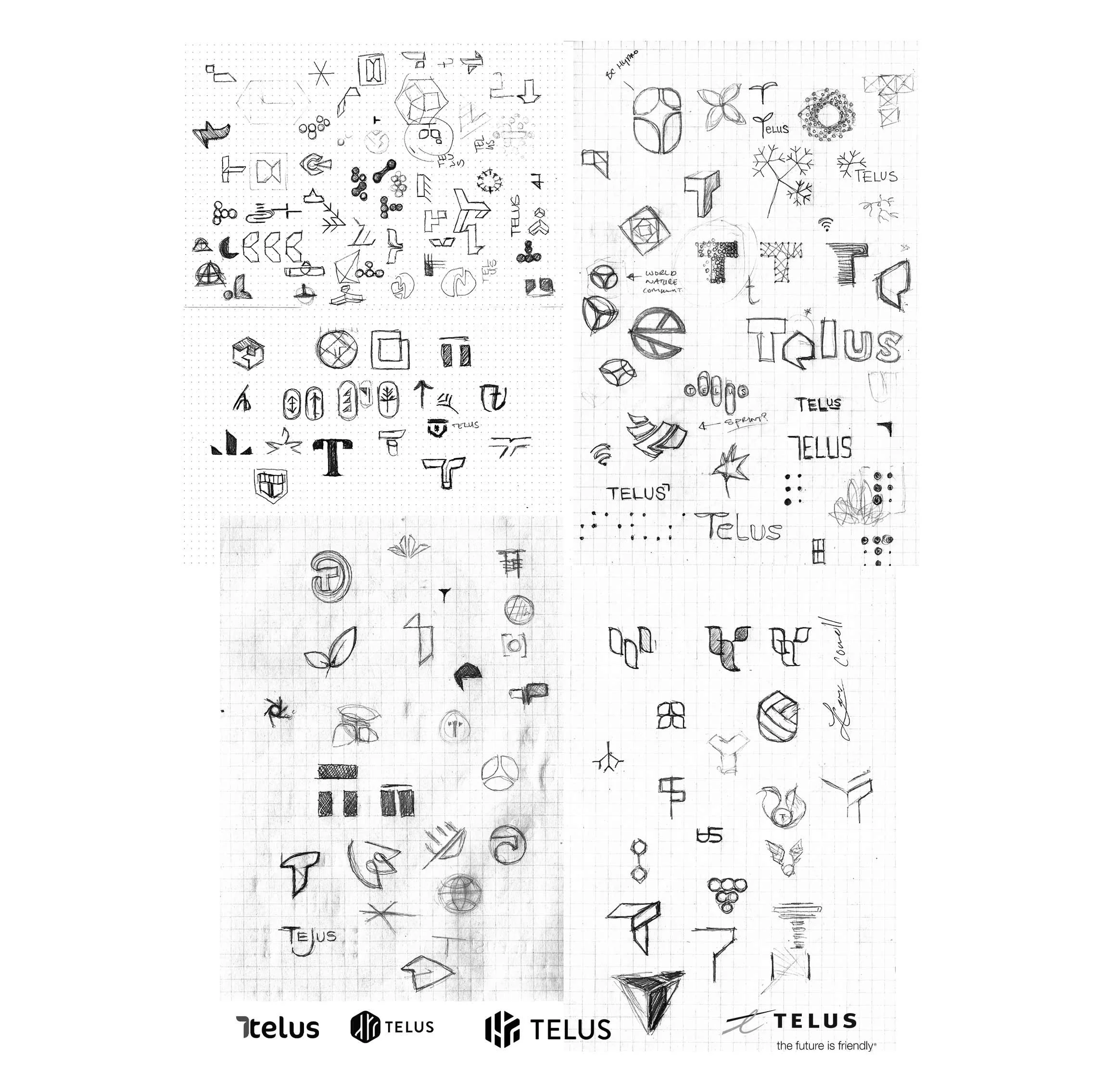
The final concept presented was not the initial direction for chosen for TELUS. The initial concept was refined to a point where it felt balanced and would work well with the intended project brief, however it felt too static and “corporate” for a telecommunications company like TELUS. They needed something more exciting and dynamic in application which would help communicate their goals, values, objectives, to their consumers. This thought process is what led to the final direction and design solution.