Case Study: City of Vancouver
SITUATION AND OPPORTUNITY
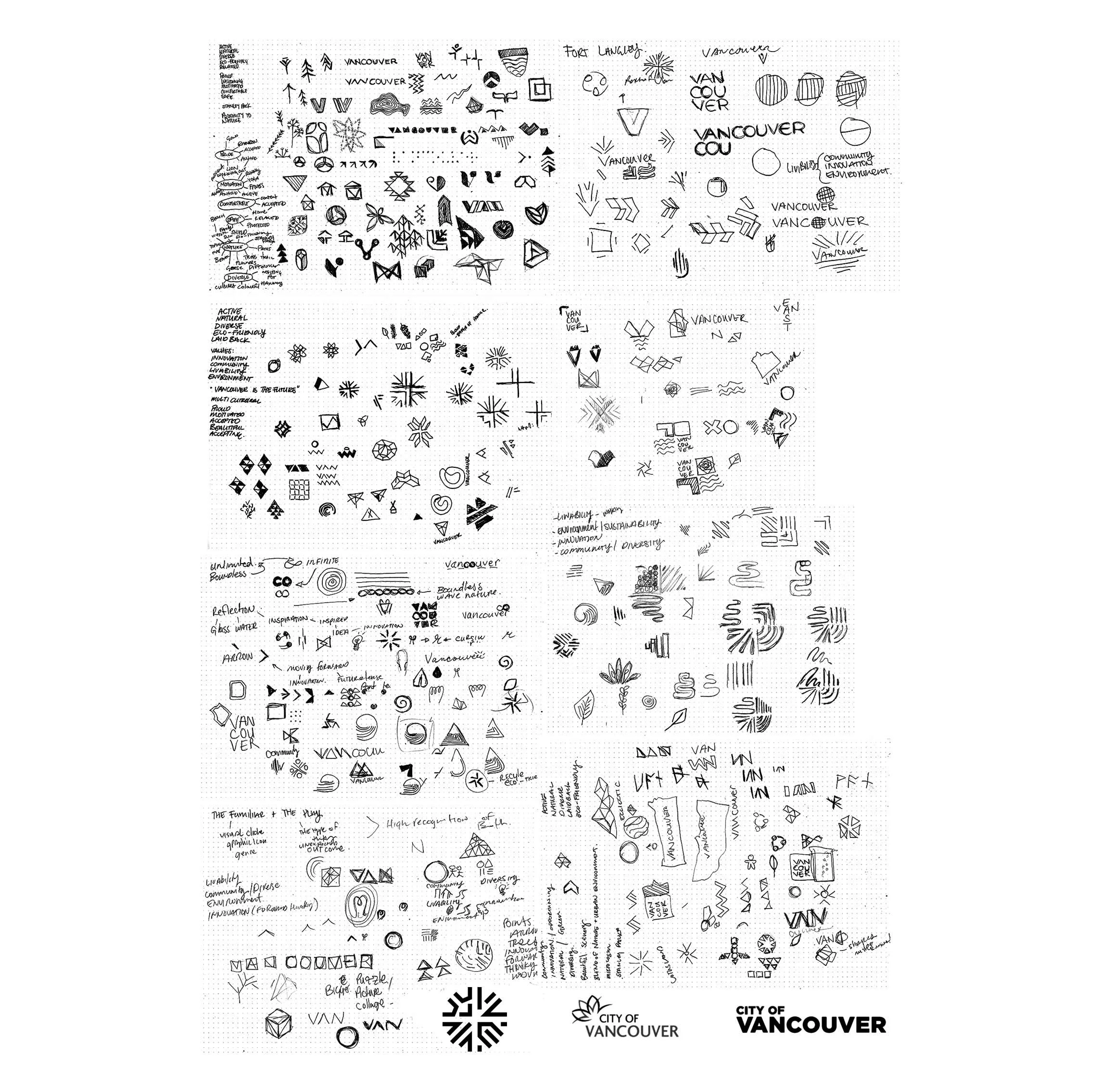
In our fourth year of the Graphic Design for Marketing program at the Wilson School of Design, we were given a semester-long project to research, identify, and define an existing or hypothetical design situation. For my project, I choose to tackle rebranding the City of Vancouver.
The city’s progressive mindset and diverse population sets it apart from other cities. It’s been recognized as the most livable city in North America, with aspirations to become the most sustainable city in the world. These achievements among many others defining qualities, show Vancouver as the future of urban planning, and deserve a visual identity that truly reflects what the city has to offer to the world.
RESEARCH AND STRATEGY
Through my research it became clear that Vancouver is more than just a beautiful coastal city. Not only associated with being clean, green, and sustainable by its abundant visitors, it is becoming a tech hub for all kinds of start-ups from small local businesses to large multinational satellite offices. It’s home to a thriving film and television industry, and was the host of the 2010 Winter Olympics. The list of positive accolades goes on, and continue to make Vancouver stand out among places to live and visit.
To develop a deeper understanding of Vancouver, I needed to dive deeper into the city’s inner workings; this is expressed through the people, culture, and how it all interacts with the city. Understanding these assets help provide a clearer picture of Vancouver.
Vancouver is home to more than 600,000 citizens, with the largest age group ranging from 25 – 39 years old. These individuals are an eclectic mix of different nationalities and ethnicities. To gain a better understanding of their perspective of Vancouver, I conducted an online survey asking the target audience various question regarding their opinions of the city.
The results showed that people are proud to live in Vancouver and to call it their home. They appreciate what it has to offer, from its natural surroundings to its diverse neighbourhoods. They feel motivated by the city, and use this motivation to be active in their communities. They feel accepted and welcomed, and collectively agree that the city is a beautiful place to be in.
In order to appeal to such a large, diverse target market, the proposed brand for the City of Vancouver will focus on the identified key values of the city that were discovered through the findings in my research and feedback from the audience.
DESIGN SOLUTION AND OUTCOMES
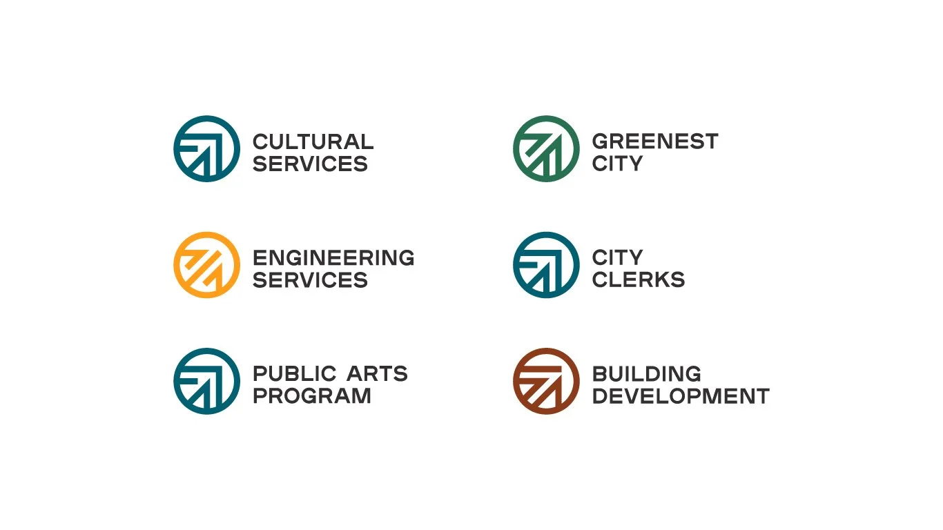
Vancouver is a melting pot of communities that is ever evolving and growing, striving to be better for its citizens and the environment. It is a city well suited for a brand system that is bold and dynamic. A system that provides a solid foundation to represent all of Vancouver’s defining aspects, from its people, diversity, culture, and environment.
The emblems are inspired by woodcarvings and the city’s humble beginnings as a small sawmilling settlement in the late 1800s. The geometric shapes they create are reminiscent of the techniques used in this industry and provide a visual representation to the key values that identify Vancouver.
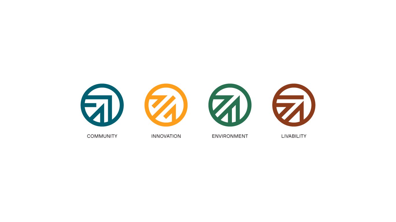
The supporting colour palette is inspired by the beauty of the city and its surrounding environment, and make each emblem more distinct.
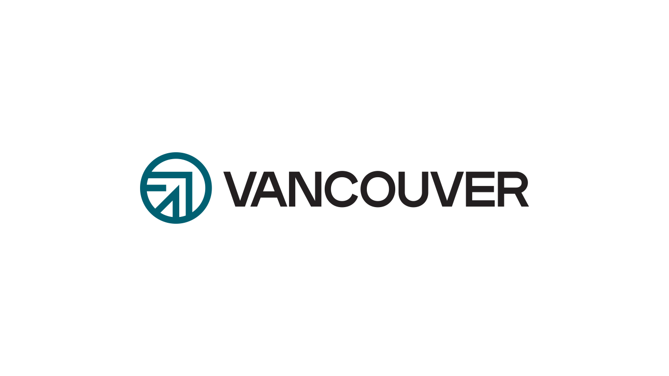
The principle emblem used for the City of Vancouver will be represented by the symbol for community, as the diversity of the citizens are the heart of Vancouver.
The principle wordmark utilizes a strong and heavy san serif typeface that displays unique little quirks to each letterform and provides a strong, bold presence.
Rebranding the City of Vancouver proved to be a one of the more challenging projects I have taken on. It was an opportunity to develop my skills in place branding, and creating a visual identity that would represent both the city and its citizens. The initial concept and the variety of materials that were initially presented at the end of the project had the opportunity to be refined, with focus on simplifying the brand system and applications based on the feedback that was given. If more time was allotted to this project, I would have liked to have conducted more primary and secondary research and user testing with the targeted demographic.